Have you ever walked inside a room and felt a certain mood? Like the calm and tranquility feeling when you’re in an earth-coloured room such as green or light brown. Or how you feel excited or rushed when you’re in a bright, colorful space? It’s likely because of the color psychology, connecting the color to our emotions. Interior design is an art that combines our personality and preference, to create a significant representation of our inner self. But the choice of colors are important as some colors can make you feel happy and positive while other colors can be dull and bring your mood down. So what exactly is color psychology and how does it relate to interior design?
Color Psychology is a theory of how each color affects a person’s emotion and mood. It is not only widely used in branding and marketing but also a powerful interior design tool as color schemes are an important factor in interior design. Based on the results of multiple studies on the Psychology of Colors, each person reacts differently to each color. For example, some people find the color black to be depressing and demotivating, a symbol of death, grief and mourning. However, several others find the color black to represent power, order and elegance. Not only how they react to each color, there is also a cultural aspect. For example, white is a symbol of calmness in Western cultures. At the same time, it is a symbol of loss in Eastern societies. Red is a color of anger and aggressiveness in Western cultures. However, red in Chinese culture represents luck, joy, happiness and a color of celebration. The psychology of color is important in interior design as it highlights the purpose of the space and leads people to act in a certain way.
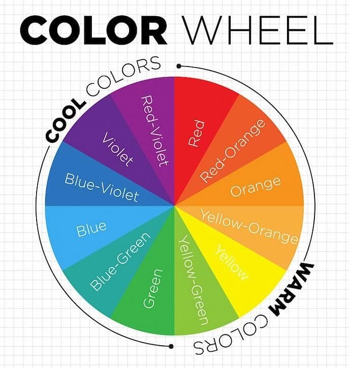
Here’s a few colors commonly used in interior design and their effects to people’s mind and emotion :
1. Red
The color red is the most vibrant color that represents a lot of emotions! By adding red in an interior design, it adds excitement and vigor to the entire room and represents a lot of other emotions depending on where it is being used. In offices, red inspires leadership, willpower and high energy levels. When used in the living room, the color red in all its shades inspires friendship and stimulates conversation. Red in the bedroom represents the feelings of love, desire, and passion. Red is one of the primary colors and is best to match it with a calming color tone such as white and beige as red also inspire the feeling of anger and revenge.

source : Pinterest
2. Yellow
Yellow, another one of the primary colors which often represent joy, happiness, optimism and care and often used in kitchen, dining area, hallways and living room as it makes the room feel bright and sunny. Yellow is also associated with intellect, excellence and prosperity, due to its close associations with the color gold. It is best to use yellow in the bright shade as dull yellow colors instigate a feeling of doom, decay, and sickness. It is best to be paired to gray or white as a completely yellow room can drive up blood pressure!

source : Pinterest
3. Blue
Blue is definitely one of the most calming colors as it relaxes your mind, slows down all the pressure and has a healing effect. Blue is the color you literally can use anywhere and matching them with other colors or shades as well! Most dark shades of blue are associated with elegance, luxury, and royalty meanwhile the light shades of blue are easy on the eyes and decrease any discomfort. It also represents meanings of depth, trust, loyalty, sincerity, wisdom, confidence, stability, faith, and intelligence.

source : Pinterest
4. Green
When people see the color of green, they’ll think of nature which is why green is often described as refreshing and tranquil. Green is a versatile color, a different shade of green expresses different emotions as well. While light and aqua green have a calming effect, dark green is mostly associated with greed and jealousy. Olive green on the other hand is recognized worldwide for peace and harmony.

source : Pinterest
5. Orange
Orange is another vibrant color, this vibrant hue symbolizes adventure, ambition, creativity, and sociability. Orange is often associated with positivity. As a fellow vibrant color, orange also inspires desire, love, sexuality, and appetite like red color. Due to how orange can raise appetite, orange is well suited for indoor and outdoor kitchen area and dining rooms as well.

source : Pinterest
6. Purple
The color purple is usually associated with elegance, luxury, richness and royalty. Purple color schemes work well in areas that inspire creativity and design which is a great color for dressing rooms, walk-in closets, in-house art studios, or even the kitchen. This color is popular with young kids and teenagers as it is also sometimes associated with magic, peace, and pride.

source : Pinterest
7. Pink
The color pink influences emotions that are closer to the heart. Pink and all its shades create an atmosphere of love, nurture and compassion as it is a mix of red's passion and white's purity. Despite being largely associated with feminism, you can still use this color for a masculine effect as well!It is because the nature of the colors are firm and hard. The pink color also matches the brown color. Pink is best used in the room color for teenage girls or in the living room and bathroom to create an atmosphere of joy and bliss.

source : Pinterest
8. Brown
A neutral color such as brown is one of the most used colors in interior design along with white, black and gray. Brown can symbolize resilience, safety and security, as well as warmth and comfort. The color brown represents steadfastness, simplicity and dependability. It usually would be matched with the color green, conveys a natural tone or other bright colors such as yellow, white, red and orange since brown has a tendency to evoke depression and loneliness.

source : Pinterest
9. Black
The color black has always fared well with versatility and elegance. Black signifies simplicity and functionality. It is a color that can be used in almost all rooms, it especially works best in modern interior design style! Having an all-black room wouldn’t be recommended since all-black rooms can be overwhelming and gloomy.

source : Pinterest
10. White
White is the most used color in interior design as it goes with pretty much every other color! Most people would associate white with purity, innocence and cleanliness. White is often seen as calming and soothing. It can have a sense of clarity and freshness, which is why it is a popular choice for minimalist and modern designs. White can also create a sense of spaciousness, making it ideal for small rooms or areas with limited natural light.

source : Pinterest
11. Gray
Just like black, gray color is highly associated with elegance and style. Gray's add a touch of balance, harmony, and calmness to any interior. However, as every color has nuances, gray can also be tricky because it can look dull, cold, or depressing but it can be used as a neutralizer for other vibrant color schemes.

source : Pinterest
In conclusion, color psychology is an important aspect of interior design as well! The use of colors would definitely affect your emotions and moods, use this psychology of colors to make your home a cozy and comfortable space. Consult your dream house with Livvy Luxury Living! Contact us on Whatsapp : +62 878 6894 8000 or visit us at 18 Office Park 25th floor Suite A, Jalan Simatupang Kav 18, South Jakarta.
Content Writer : Arcelia Emmanuella Adiwinata